Moving into my own house was a long life dream … alright my all time dream is a mansion with a slide going from the bedroom to the pool but you know one can dream right … I have always wanted to build our home but I’d need to move back to France for that and well … don’t feel like it at the moment.
So instead I thought why not look at the designs I love and then do some work in them … for our first home we did not have an extensive budget so we can’t really extend or break walls for now but baby steps … I often (read constantly) read blogs about designs mainly the US ones because they have the style that I adore. I go to Studio Mc Gee for most of my home inspiration and they are a truly amazing couple (or should I say team because they have expend like bread production). I love their white and chic but modern designs with yet a little touch of rustic …
For me my house has to be white … I know I have a kid and white gets dirty but you know what … it washes and so do your kids hahah white brings so much brightness and we live in England where we don’t always see the sun and it’s always warm. It also makes a room look so much bigger which is also great for small English hobbit houses (Oh did I dare saying hobbit houses) PARDON ME (not).
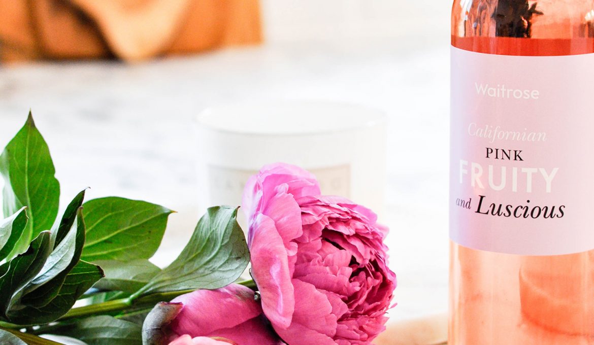
So white walls (Dulux) and a little Mr Muscle white magic sponge that does wonders when we have a mark on the wall … so far the walls are still white … I love to then add touches of colours to bring a bit of live and a pop of colour.
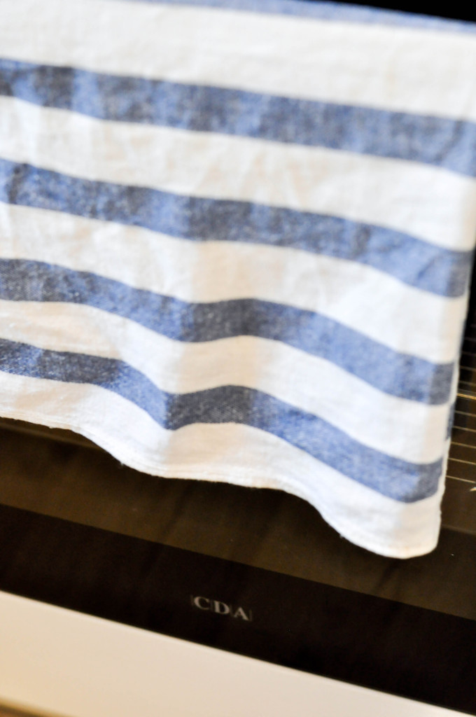
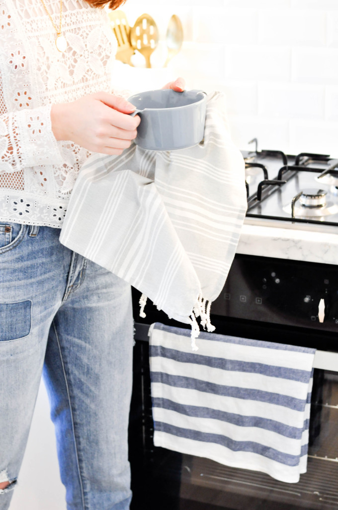
Cloth Home Sense UK
For the kitchen design I wanted to incorporate a few compulsory things …
White subway tiles (because somehow it makes me think of Paris and big cities like London and NYC that I miss)
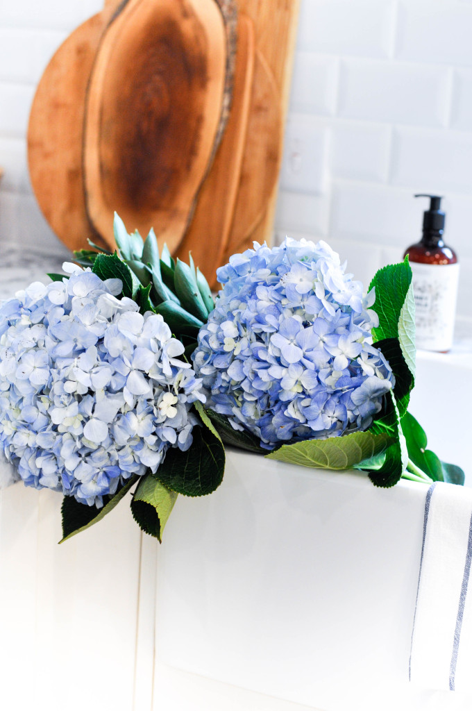
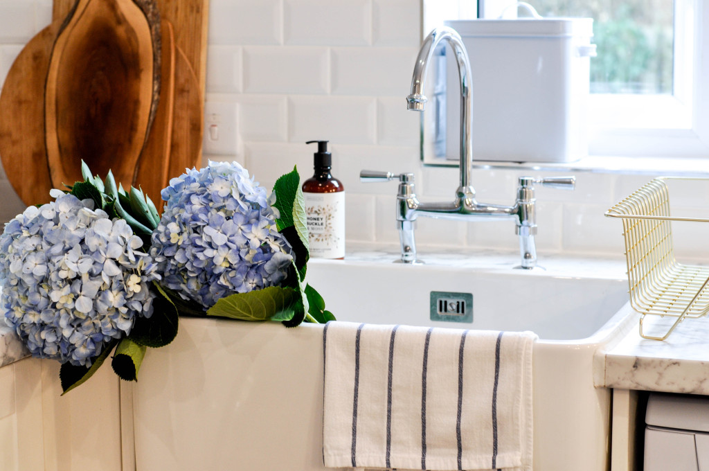
A white butler’s sink from CDA because they are so beautiful (heavy haha) and so big … they can hold my flowers (Instagram purposes of course) and they just look so chic yet so old fashioned and farm like perfect for our countryside living
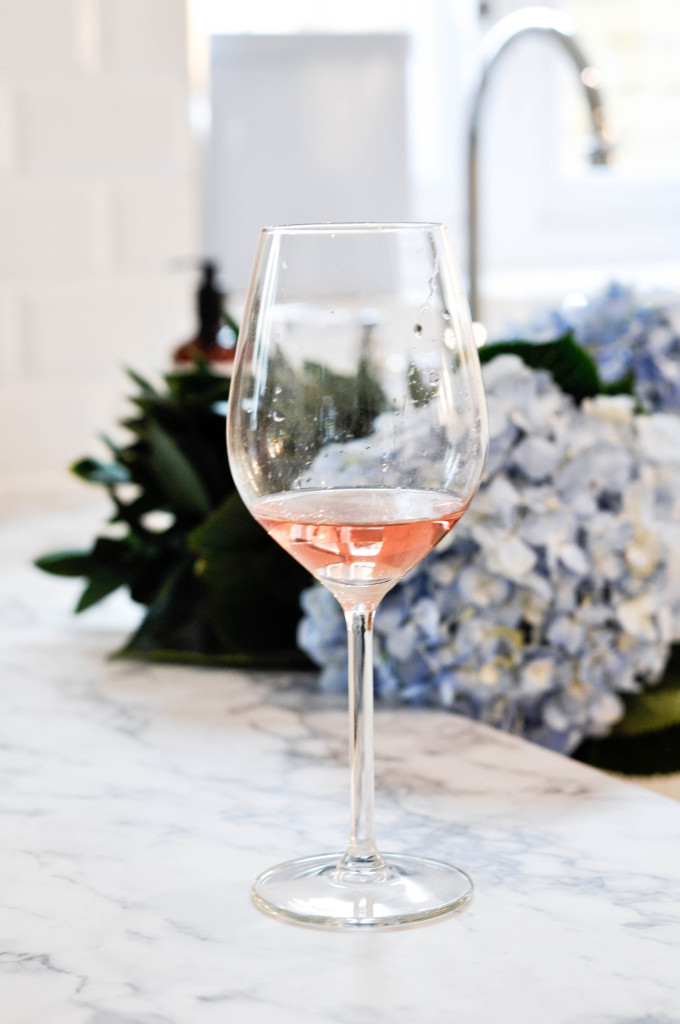
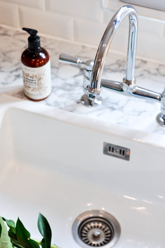
A touch of marble so a good marble look alike countertops from Bushboard was a must in here …
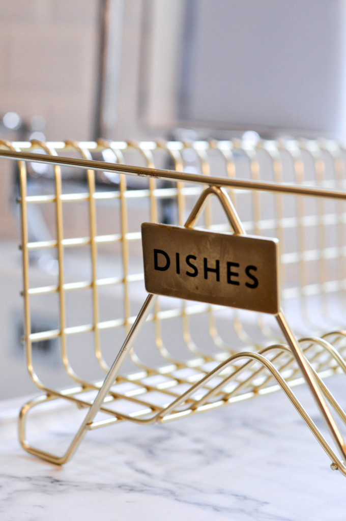
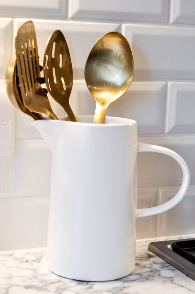
Gold set and vase Next Home
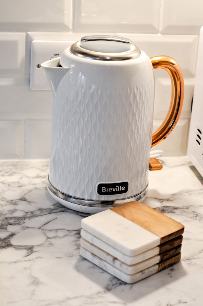
We then added touches of colours like our KitchenAid which is red and some light blue accent with some wood and touches of gold or copper …
We are so satisfied with the Porcelaine Superstore tiles they look beautiful and I have chosen a white sealer instead of a grey one just because I wanted that all white chic aspect but grey would look fab if you are looking for a industrial looking style like a loft in Dumbo or Shoreditch you know.
Our countertop from Bushboard is one of my favourite of all because … well … I sit very often on my countertop to reflex on my life hahah and also to escape my mini that can’t climb over me when I am too high hahah #sadmum. It’s a really good quality and heavy duty you can see it … we have done some stains on it like everyone and a quick wet cloth and it’s gone I thought white would be harder to clean and I would easily see the dirt on it but it’s so much better to be honest so I am really pleased and if I ever get another house I will definitely be doing the same countertops. My friend Danielle has a similar one in her new kitchen and hers is granit and also laminate on some parts and look fab … check her our btw she is at Fashionista Barbie.
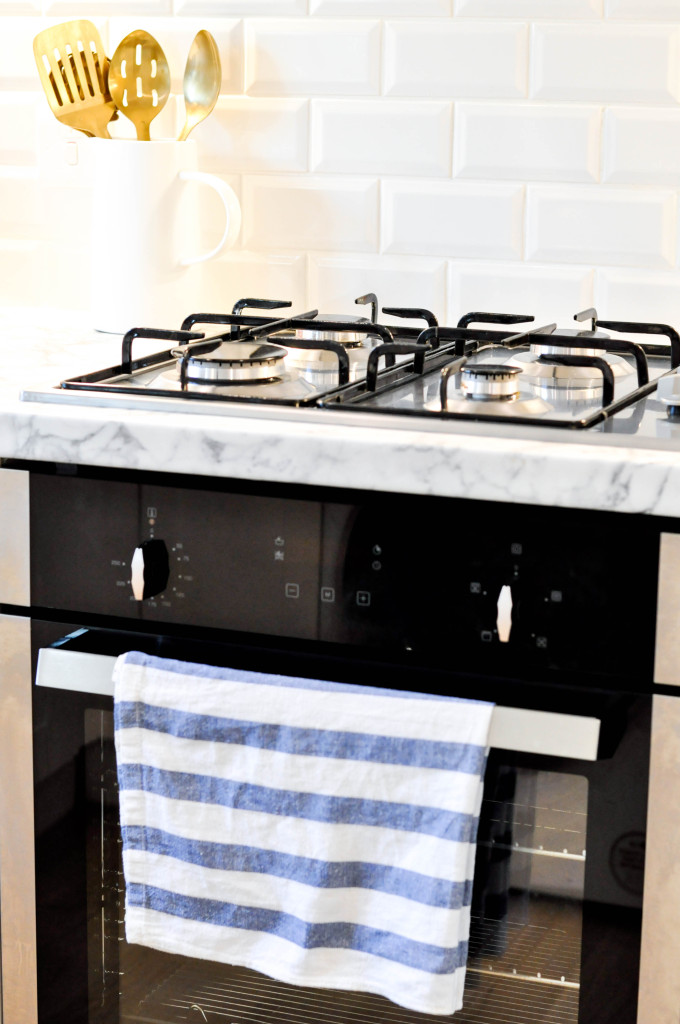
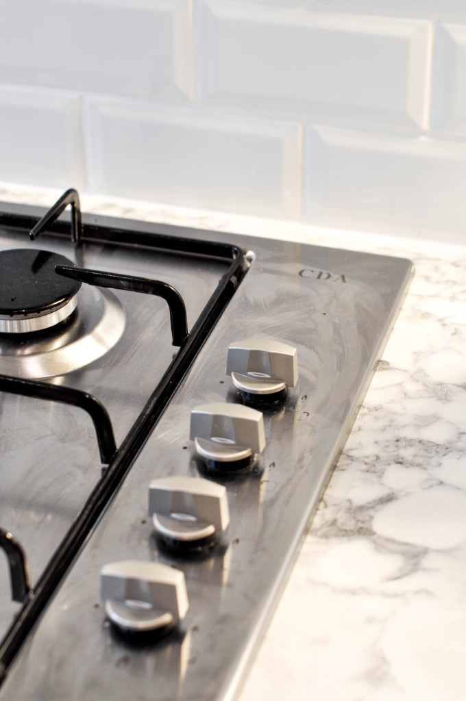
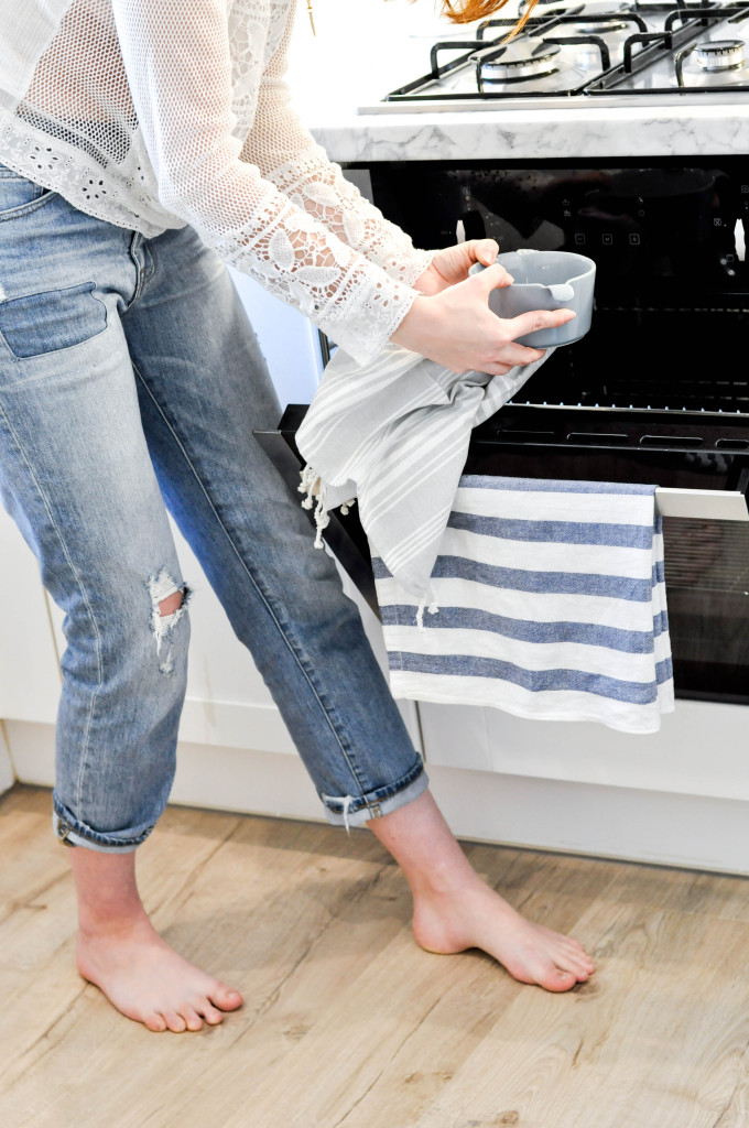
Nest is our sink from CDA and our oven and hobbs … we needed new oven/hobbs as the other one was a double one and it was hard to put a whole Turkey in hahah and the bottom one was broken so we went to our trusted CDA group and asked them for a simple yet efficient and good oven and we are so pleased we are cooking away every single day and it’s perfect. It’s easy to use (even Liam can do the touch screen haha) and it really work well never over cooks and it took us maybe one go to figure everything out in terms of heat and so on. The sink is my favourite part of the kitchen it really was a dream since I was maybe 14/15 I saw one in an film and thought that’s the sink I was … fast forward 14 years and I finally have my dream come true … (again sad life to dream of a sink but hey ho)
It cleans really well and I will tell you that for the sink itself and the tap a little lemon and a good cloth will do miracles …. (you’re welcome)
The final part was to paint the cabinets white so they did not look too creamy with the whole white background, we went straight to Annie Sloan for her popular chalk paint … we are very pleased with the quality, it is really wonderful how it looks just perfectly normal yet it was painted and waxed … it has not moved so far and I will let you know in a year or so for another update on the kitchen quality …
Some people have asked me how we afford all of this and I am quite open and you know how bloggers’ job go about so we were very kindly gifted the tiles, the countertop, the sink, oven and hobbs as well as the paint and a few accessories from Home Sense and Next Home as well as our KitchenAid UK. We only then paid for the labour … I am all about refreshing a home without spending millions and making it look fabulous!
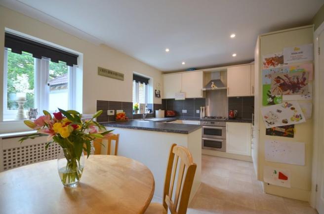
Look at the difference though … I mean this house was love at first sight really … the previous owners were so sweet and really made us want to make our own memories in the house. It was all clean and modern but I always wanted a white kitchen so there was the before …
Hope you love the fresh new look we gave to the kitchen …
xo S.
A massive thank you to Bushboard, CDA group, Porcelaine Superstore, Next, Home Sense, Annie Sloan, KitchenAid for your support on this project and for your patience. We are so grateful to work with wonderful people …


